
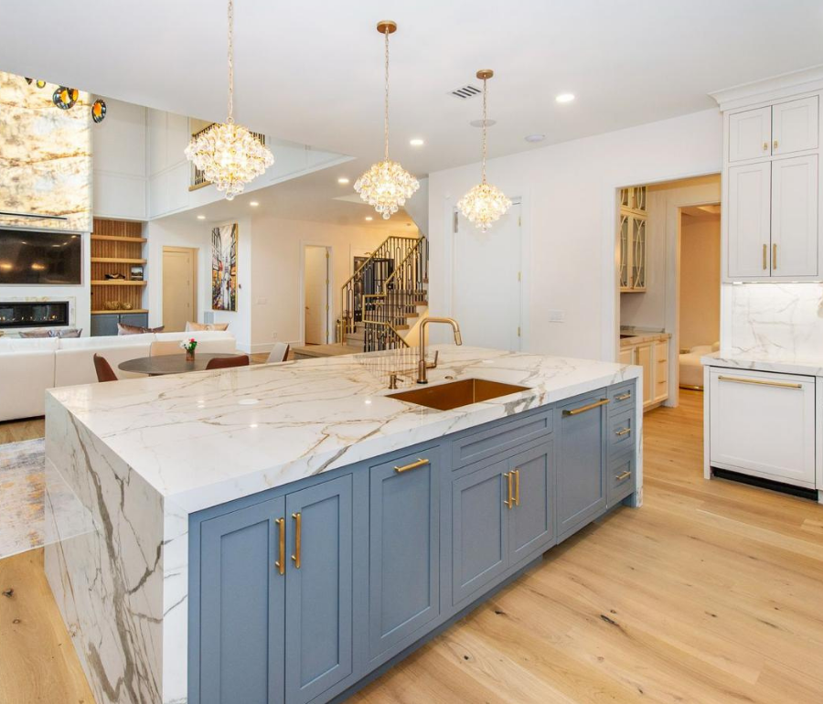
The kitchen has evolved far beyond its traditional role as a space used only for food preparation. With the rise of open-plan architecture, it has become one of the most visible and frequently used areas of the home. Kitchen islands now serve as preparation surfaces, informal dining areas, gathering points, and visual centerpieces. As a result, the material selected for the countertop has a direct influence on the atmosphere, functionality, and architectural identity of the entire living space.
Among the surface solutions shaping contemporary kitchen design, porcelain countertops stand out for their wide range of colors, patterns, and large-format applications. Inspired by the visual character of marble and other natural stones, porcelain surfaces allow designers to introduce expressive veining and layered mineral effects into kitchens with a controlled and consistent design language.
Large-format porcelain slabs are especially valuable in modern interiors because they allow expansive islands, countertops, backsplashes, and wall panels to be designed with fewer visible joints. This creates a cleaner architectural appearance and helps different parts of the kitchen feel visually connected. The same surface can continue from a horizontal countertop onto a waterfall edge or vertical backsplash, producing a unified composition throughout the room.
Porcelain countertop designs also offer considerable stylistic flexibility. White surfaces with warm gold veining can support bright transitional kitchens, while soft gray patterns work naturally in minimalist and contemporary interiors. More expressive designs featuring green, black, and mineral-inspired movement can turn the kitchen island into a statement feature that defines the broader material palette of the home.
The relationship between the countertop and surrounding elements is equally important. Cabinetry, flooring, hardware, lighting, and wall finishes should be selected as part of one complete composition. A heavily veined surface may work best with restrained cabinetry, while a quieter porcelain pattern allows decorative lighting, timber finishes, or metal accents to become more prominent.
This article examines three distinctive approaches to porcelain kitchen countertops. The first section focuses on Macchia Vecchia Porcelain, known for its white background and warm gold-gray veining. The second explores Calacatta Porcelain, which supports bright and balanced kitchen interiors. The final section introduces Ice Jade Porcelain, a more expressive surface inspired by green minerals and dramatic natural stone formations.
Together, these three designs demonstrate how porcelain countertops can reproduce the visual depth of natural stone while responding to a wide range of contemporary kitchen styles.
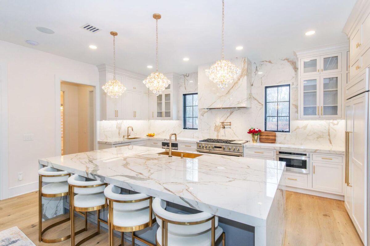
Modern Kitchen Island Designed with Macchia Vecchia Porcelain
Macchia Vecchia Porcelain for Bright and Expressive Kitchen Interiors
Macchia Vecchia Porcelain is one of the most distinctive surfaces used in natural stone-inspired kitchen design. Its bright white background is crossed by broad gray movement and warm gold veining, creating an appearance that feels both architectural and decorative. The pattern offers enough visual interest to define a large kitchen island while remaining compatible with bright cabinetry and neutral interior palettes.
Large-format applications allow the Macchia Vecchia pattern to develop across generous surfaces without unnecessary interruption. On an oversized island, the movement of the veins becomes easier to appreciate, turning the countertop into one of the primary visual features of the kitchen. The same surface can be continued onto side panels to create a waterfall edge, reinforcing the impression of a single sculptural volume.
This type of design is particularly effective in open-plan homes where the kitchen is visible from dining and living areas. Because the island often occupies the center of the interior, its surface must work as both a practical worktop and a decorative architectural element. Macchia Vecchia Porcelain supports this dual role through a pattern that feels expressive without becoming disconnected from the rest of the space.
White and soft ivory cabinetry create a calm background that allows the veining to remain visible. Brushed brass handles, gold-toned faucets, and warm pendant lighting can connect naturally with the warmer veins in the porcelain. These details should be used with restraint so that the kitchen remains balanced rather than becoming excessively decorative.
Natural timber also forms a successful partnership with Macchia Vecchia Porcelain. Oak or light walnut flooring introduces warmth beneath the bright countertop, while timber shelving and furniture prevent the kitchen from feeling overly white or clinical. This relationship between porcelain, wood, and metal creates a layered material palette suited to both contemporary and transitional interiors.
Lighting plays an important role in how the surface is perceived. Daylight reveals the contrast between gray and gold movement, while warm evening lighting softens the white background and intensifies the warmer mineral tones. Pendant fixtures positioned over the island can emphasize selected areas of the pattern, making the countertop appear different throughout the day.
Macchia Vecchia Porcelain is also well suited to full-height backsplash applications. Continuing the same surface behind the range or sink creates visual continuity and reduces competition between unrelated patterns. In kitchens with detailed veining, using the same material across multiple surfaces often produces a more controlled result than combining several different decorative finishes.
The direction of the pattern should be planned before fabrication. Veins can be positioned to lead the eye across the island, connect the countertop with the waterfall edge, or create a focal area around the sink and preparation zone. Thoughtful slab layout helps the surface appear intentional and architectural rather than randomly assembled.
Creating Material Continuity with Macchia Vecchia Porcelain
A successful kitchen design depends on how consistently its materials relate to one another. Macchia Vecchia Porcelain can be used as the main surface across the island, perimeter countertops, backsplash, range hood surround, and selected wall panels. Repeating the pattern in carefully chosen areas establishes continuity while allowing cabinetry and architectural details to remain visually calm.
In larger kitchens, the island may feature the strongest veining while quieter sections of the surface are used around the perimeter. This creates a hierarchy in which the island becomes the primary focal point without making every part of the room equally intense. The result feels structured and deliberate.
Edge design also changes the character of the countertop. Slim profiles support clean minimalist kitchens, while visually thicker edges give the island a more substantial architectural presence. Waterfall panels can extend the porcelain vertically to the floor, creating a monolithic appearance that works especially well in open-plan layouts.
Macchia Vecchia Porcelain can therefore be interpreted in several ways. Paired with white cabinetry and polished brass, it creates a bright and refined kitchen. Combined with natural oak and matte finishes, it becomes warmer and more relaxed. Used with dark metal frames or black window systems, it delivers stronger contemporary contrast.
Its ability to work across different design languages makes it a suitable choice for custom residences, modern villas, apartments, hospitality projects, and high-end kitchen renovations. Rather than functioning as a background surface, it becomes an active part of the architectural composition and helps connect the kitchen with the wider living environment.
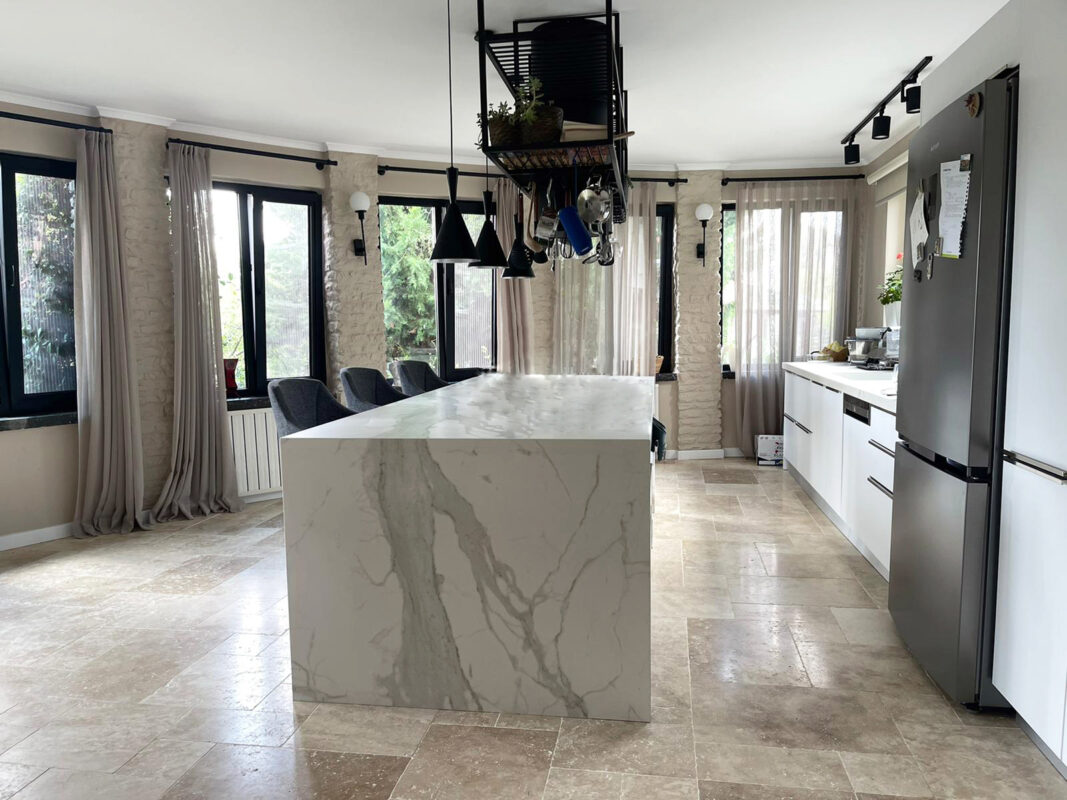
Bright Kitchen Interior Featuring a Calacatta Porcelain Island
Calacatta Porcelain for Bright and Balanced Kitchen Design
Calacatta-inspired surfaces remain among the most widely used options in contemporary kitchen architecture because they introduce natural stone character without requiring an overly complex color palette. A white background combined with soft gray veining creates visual movement while preserving a calm and open atmosphere. This balance makes Calacatta Porcelain suitable for kitchens where brightness, continuity, and restrained detailing are central to the design.
In the second image, the porcelain surface becomes the main architectural feature of the kitchen island. The broad white field reflects daylight, while the gray veins create enough variation to prevent the surface from appearing flat. This relationship is particularly effective in spacious kitchens where the island is visible from several directions and functions as both a work surface and a social gathering point.
Large-format porcelain slabs allow the pattern to continue across the countertop with fewer interruptions. When the surface extends vertically along the island sides, the design gains a more solid and sculptural appearance. Waterfall edges are especially effective with Calacatta patterns because they preserve the relationship between the horizontal and vertical planes while emphasizing the clean geometry of the island.
Calacatta Porcelain also works naturally with a wide range of cabinetry finishes. White and ivory cabinets produce a seamless monochromatic composition, while light oak and walnut introduce warmth without competing with the veining. Soft gray cabinetry creates a more tonal interior, whereas matte black details add sharper contrast and help define handles, faucets, lighting fixtures, and window frames.
Metal accents can be selected according to the desired atmosphere. Brushed nickel and stainless steel create a cooler, more technical appearance, while brass and bronze introduce warmth. Black fixtures offer a graphic contrast that works well in contemporary kitchens with minimal cabinetry and clean architectural lines. Because the porcelain surface is visually controlled, these supporting materials can be adjusted without disrupting the overall balance.
The backsplash provides another opportunity to extend the Calacatta pattern. Using the same porcelain behind the sink or range reduces the number of unrelated materials in the room and creates a more coherent visual field. Full-height backsplash applications are particularly effective in open kitchens because they connect the worktop with the upper wall and make the entire cooking zone feel more integrated.
Lighting should be planned to support the surface rather than produce excessive glare. Natural daylight enhances the white background and reveals the gray veining gradually throughout the day. Under-cabinet lighting can clarify the pattern along the backsplash, while pendant fixtures above the island create a more focused visual zone. Warm light softens the overall composition, whereas neutral light preserves the cooler white and gray tones.
Calacatta Porcelain is especially suitable for projects that seek a refined but adaptable kitchen surface. It can support minimalist interiors, transitional kitchens, Scandinavian-inspired spaces, and modern residential projects without appearing tied to one specific style. Its visual flexibility allows the surrounding architecture to determine the final character of the room.
Using Calacatta Porcelain Across Countertops, Islands, and Backsplashes
Material continuity is one of the strongest principles in contemporary kitchen design. Repeating the same porcelain surface across the island, perimeter counters, backsplash, and selected wall panels creates a clear relationship between different functional areas. Instead of treating each surface as a separate decorative decision, the kitchen is developed around one consistent architectural material.
In compact kitchens, this approach helps reduce visual fragmentation. When the countertop and backsplash use the same Calacatta pattern, the work area appears cleaner and more spacious. In larger kitchens, the same material can be used selectively, with the strongest veining placed on the island and quieter sections reserved for perimeter surfaces.
Slab layout should be reviewed before cutting begins. The direction of the veins can visually lengthen the island, connect the countertop with the waterfall side, or guide attention toward a central feature such as the cooktop or sink. Even though porcelain patterns are more controlled than natural stone, thoughtful placement still makes a significant difference in the final composition.
Edge profiles also affect how the surface is perceived. Thin edges create a lighter and more minimal appearance, while thicker built-up edges give the countertop greater visual weight. In kitchens with large islands, a substantial edge can help the surface feel proportionate to the scale of the room. Smaller kitchens may benefit from slimmer detailing that preserves openness.
Calacatta Porcelain can also create contrast through surrounding materials rather than through the countertop itself. Dark timber cabinetry, charcoal walls, or black metal frames allow the bright surface to stand out more strongly. In lighter kitchens, texture can be introduced through timber flooring, woven stools, ribbed glass, or natural fabrics while the porcelain maintains a calm visual foundation.
This adaptability makes Calacatta Porcelain one of the most practical design choices for projects seeking a natural stone appearance with a controlled and cohesive pattern. It allows architects and homeowners to create kitchens that feel bright and considered without depending on excessive decoration.
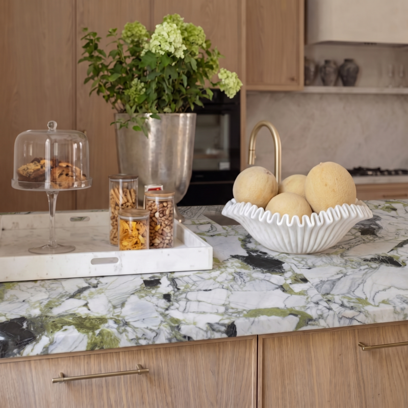
Ice Jade Porcelain Bringing Green Mineral Movement into Kitchen Design
Ice Jade Porcelain for Distinctive Kitchens Inspired by Natural Minerals
While white marble-inspired surfaces remain highly popular, many contemporary kitchens are moving toward richer colors and more expressive patterns. Ice Jade Porcelain responds to this shift through a design inspired by green minerals, layered stone formations, and natural geological movement. Its white base is crossed by green, gray, and darker vein structures that create a more individual and visually dynamic surface.
This type of pattern is particularly suitable for kitchens where the island is intended to become the main design statement. On a large surface, the movement of the green and gray areas becomes easier to appreciate, allowing the countertop to function almost like a horizontal artwork. Rather than blending quietly into the room, Ice Jade Porcelain introduces a clear material identity.
The success of an expressive surface depends on the restraint of the surrounding design. Flat-panel cabinetry, simple hardware, and controlled lighting allow the porcelain to remain the primary focus. If too many patterned materials are introduced nearby, the kitchen may feel visually crowded. For this reason, Ice Jade works especially well with calm architectural backgrounds and carefully selected complementary finishes.
Natural wood is one of the most effective materials to pair with Ice Jade Porcelain. Light oak softens the cooler green and gray tones, while walnut introduces greater depth and warmth. Timber cabinetry also reinforces the connection to nature, supporting interiors influenced by biophilic design principles.
Metal accents can create different interpretations. Brushed brass highlights the warmer mineral sections and adds a refined contrast. Matte black fixtures emphasize the darker veins and produce a stronger contemporary expression. Stainless steel offers a more neutral approach that allows the porcelain pattern to remain dominant.
The surface also works well with indoor planting and natural textures. Greenery, woven seating, linen fabrics, and handcrafted ceramics can extend the organic character of the porcelain into the wider living space. In open-plan interiors, this connection helps the kitchen feel integrated with the lounge and dining areas rather than functioning as a visually separate zone.
Large-format slabs are especially important with expressive patterns. Fewer joints allow the mineral movement to remain continuous and make the surface feel more natural. On a waterfall island, the pattern can continue from the top down the sides, giving the kitchen a more sculptural and unified appearance.
Lighting must be planned carefully because different color temperatures can change how the green tones are perceived. Natural daylight reveals the full range of gray, white, and green transitions. Warm artificial light can soften the surface, while neutral lighting provides a clearer and more accurate representation of the pattern.
Ice Jade Porcelain is therefore well suited to custom residences, designer kitchens, boutique hospitality interiors, and architectural projects where a more distinctive countertop is desired. It provides an alternative to conventional white surfaces while preserving the clean geometry and large-format possibilities associated with contemporary porcelain design.